Portfolio
The Natural
Local-loved sports bar with arcade & home-made food // Logo, Menu & Tablet Tent
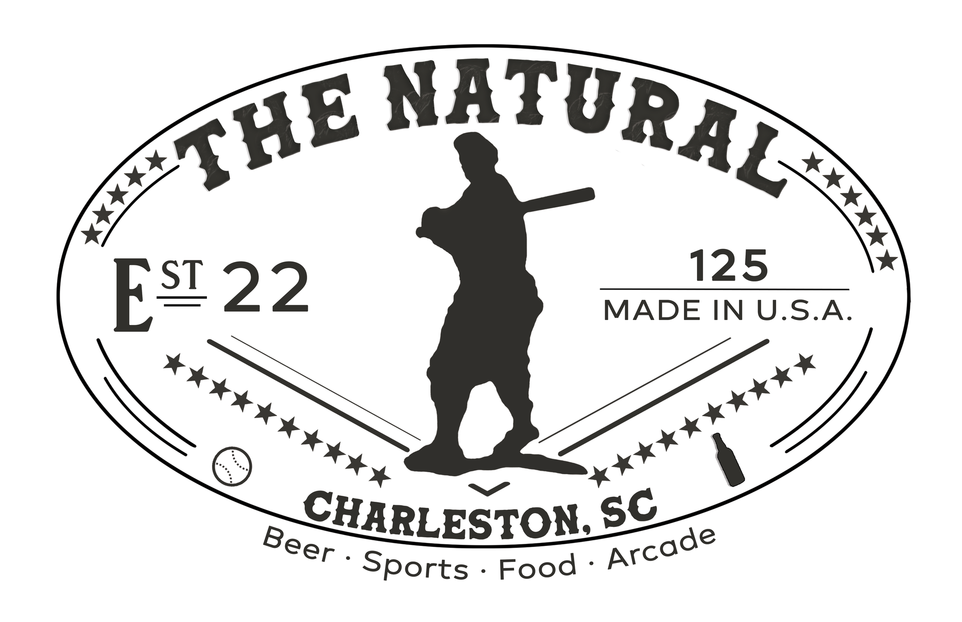
The Natural is a sports restaurant and arcade in Charleston, SC.
When beginning their new business, The Natural was looking to develop an identity as a local-friendly, inviting sports bar with home-made food and a good atmosphere. They wished to appeal to sports fans and locals, and give the visual impression of "laid back, yet classy".
The owner wished to have a logo reminiscent of the old Louisville Slugger logo which would also include a silhouette of his father playing baseball.
Using Adobe Photoshop and Illustrator, I was able to compile all of these elements into a logo that combines the baseball spirit and personality of a local eatery.
The menus and table tents were designed in Adobe InDesign, which allows for precise setup via gridlines, measurement, and print guidelines.
The menus feature a combination of bold, creative-yet-classy serif fonts alongside highly readable lightweight body type. Both menus and table tent are designed with a paper textured background to convey the home-made feel, and contrast is used to emphasize important menu items. Division lines are used appropriately to establish organization and help direct visual flow.
Print pieces were designed in the CMYK color profile for print-readiness, and documents were setup with bleed and trim margins. The logo was provided in PNG format for scalability and lossless image quality.
Fresh Eyes
Creative project // Photo Collage

This photo collage was created for a Design & Color Theory class. The assignment was to create a collage that could effectively convey the identity of a hypothetical design business.
The design business would be called "Fresh Eyes Design", with the name referring to their approach of taking new, conceptual approaches to design problems. The desired identity was a mixture of alternative grunge and modernity.
This collage was created using a variety of images; some were photographed by myself and others licensed from Envato Elements. I used Adobe Photoshop to isolate, edit, and arrange the elements I wanted from various photographs.
The color scheme includes shades of blue, orange, and pink, with pale and dark blues making up most of the composition.
Using blue for the largest flowers, lower strands, and grunge display type allows them to merge harmoniously with the dark-grey and -blue background. The pale blue grunge type is subtle enough to help establish a grunge aesthetic without demanding more attention than necessary. Shades of orange and pink are used to add flair and visual interest - notably, on elements connected to the female figure.
The strands emerging from her chest and flower crown could be interpreted as signs of creative expression, represented by their bright colors which contrast the rest of the generally dark composition. Further, the girl is looking upwards towards the title type, directing flow of attention and assisting the visual narrative of "Fresh Eyes".
To maintain the desired element of modernity with this collage, the typefaces chosen for the primary display type are a combination of highly legible handwritten script and lightweight serif fonts.
CW Productions
Photography & videography team // Promotional Flyer & Social Media Banners
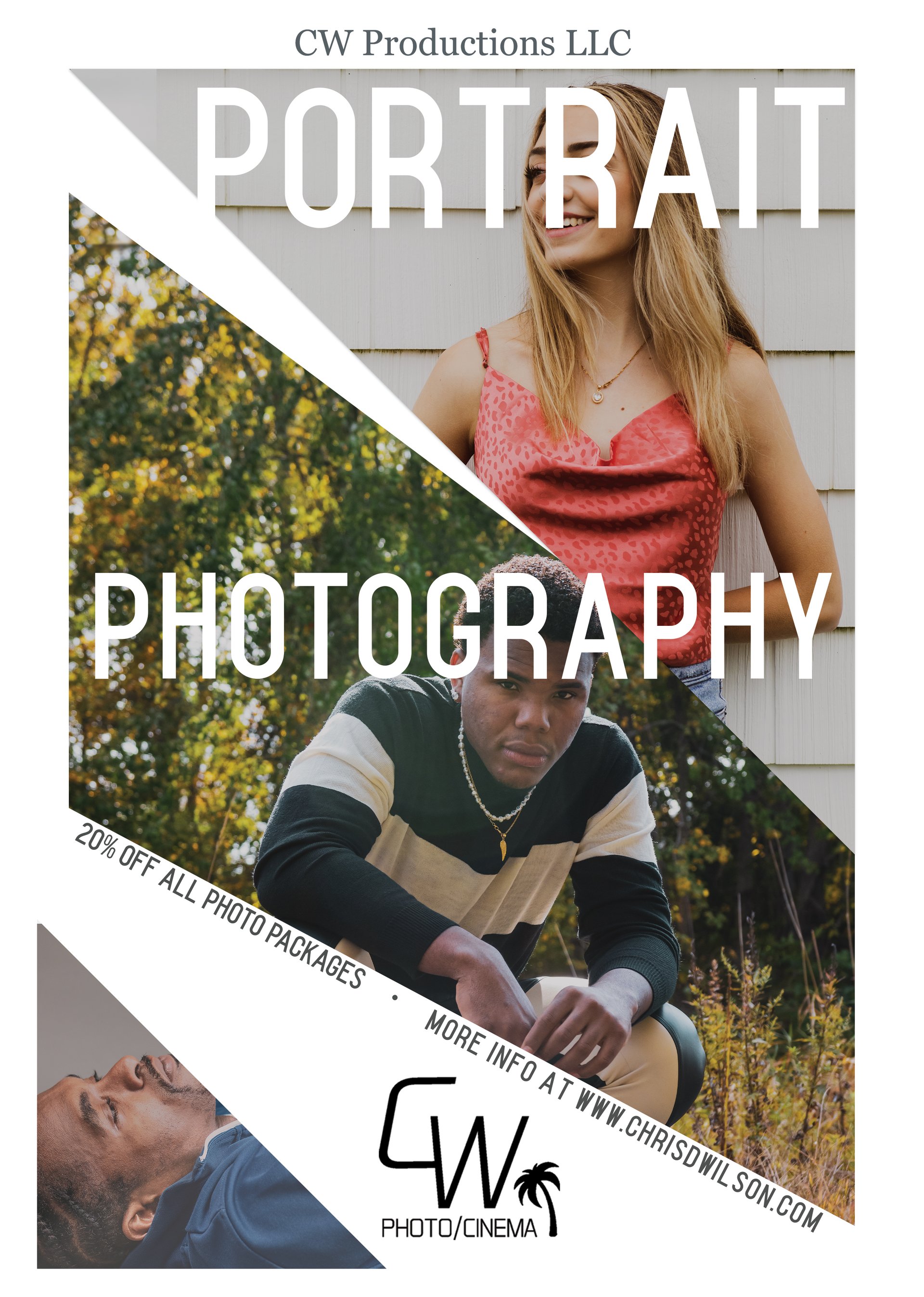
CW Productions LLC is a photography and videography team focusing on portraits and promotional photography and video.
Their desire was to create a series of social media banners and flyers which could be used to promote their services and communicate various service packages.
For this project, I was provided with a selection of their photography work to use as resources.
Using Adobe Photoshop, I made drafts of various layout options. I chose the ones that allowed
a focus on typographic information while simultaneously showcasing the team's photographic skill.
The split-screen design of the social media banners allowed me to place attention-grabbing photos on the left-hand side of the frame; the photos chosen showcased meaningful emotion and could be interpreted as subtle cases of suggestive psychology for the audience. Photos chosen for the right-hand side were purposely more subtle, including object- and theme-oriented subjects (i.e. cameras, bikes, etc.). These right-hand photos were dimmed and mostly obscured by boxes containing important information.
Photos for the promotional flyer were chosen with similar standards, focusing on photos that conveyed strong emotion and composition. Photos were also chosen with the goal of fitting into the composition appropriately; to demonstrate this, the center subject is looking directly at the viewer, while the upper subject is looking sideways towards the rest of the flyer.
The information in each composition was purposely delivered in simple, concise chunks, allowing the audience to quickly interpret the offerings of each package. Information on the independent flyer was skewed diagonally along the bottom of the angular photo box, so as to not disrupt the geometric layout.
Nomadic
Lifestyle & apparel brand // Logo, Business Cards & T-Shirt
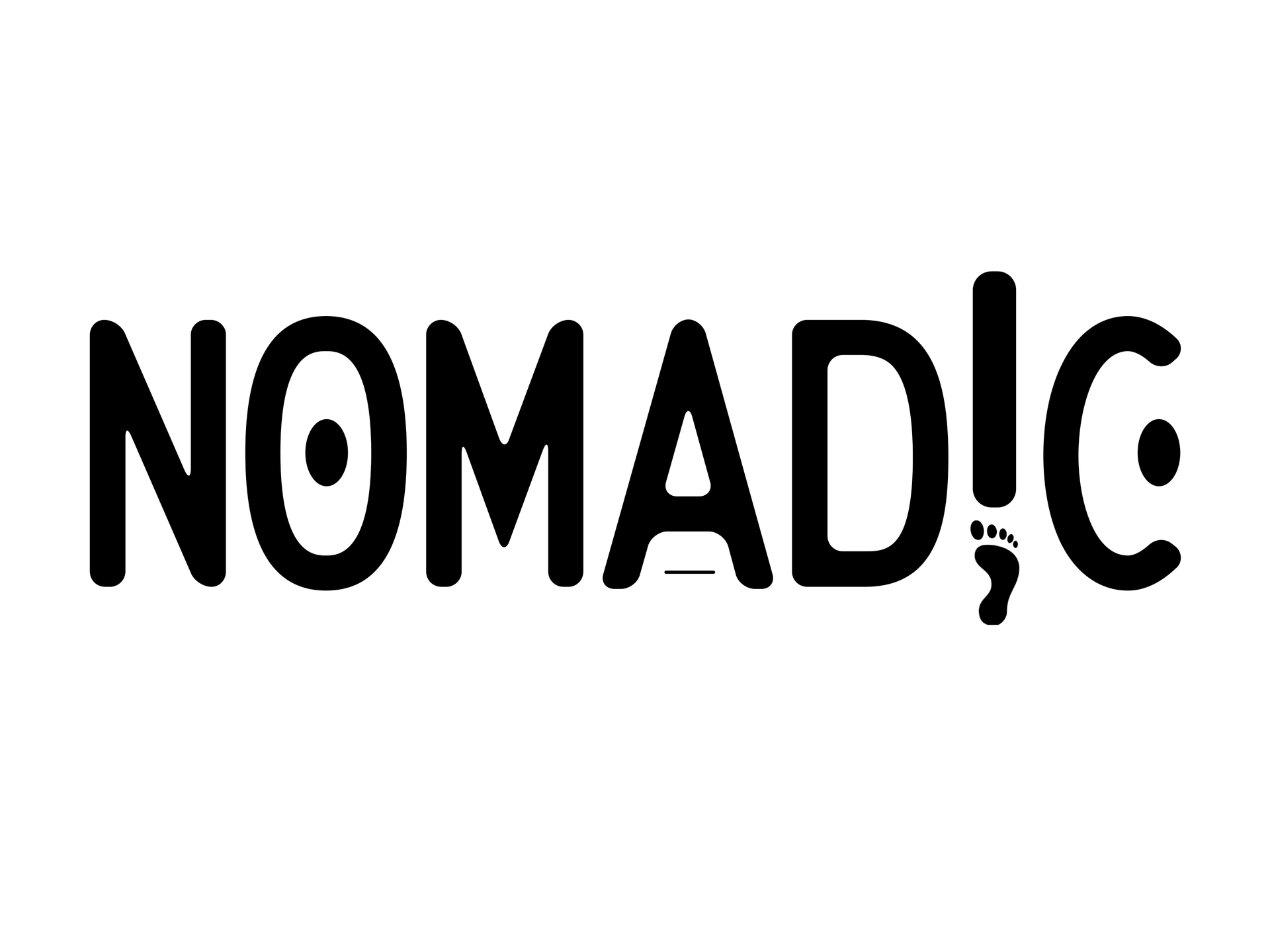
Nomadic is a lifestyle and apparel brand which aims to share the spirit of exploration, travel, and appreciation of diverse cultures.
This was created as a personal passion project, but represents a brand I hope to actualize in the future.
Nomadic is a brand that appreciates simplicity, the environment, and the joy of diversity in life. As such, the brand seeks to feel approachable, inclusive, and appealing to everyone. The style is a combination of clean ruggedness, travel, and modernity.
To convey the feeling of simplicity, the logo is predominantly typographic, with subtle iconographic elements. The typeface chosen includes all capital letters of the same height, with rounded edges and no serifs. This visually creates a smooth, simple, and focused message.
To further instill the logo with the brand's identity, a footprint is placed below the "I"; this breaks the mold of "evenness", turns the "I" into an exclamation mark, and symbolically represents the spirit of travel (strengthening the existing implication by the word "nomad"). Dots are placed inside the "O" and "C", creating balance and geometric interest; these could potentially be interpreted as eyes. Finally, a horizontal line is placed below the "A". Collectively, these geometric lines are a nod to the symbolic glyphs seen historically in cultural art and writing throughout the world.
The values of exploration, diversity, and rugged classiness are embodied on the business card design by a clean, organized, and focused layout. The front of the business card conveys all important information in a balanced way, while giving a short synopsis of brand values. The back of the business card features a topographic design, strengthening the theme of travel and exploration.
The T-shirt and coffee mug mockups offer loose, basic visual representations of potential themed apparel and lifestyle products offered by the brand.
Pine Mountain Taxidermy
Friendly small-town taxidermy shop // Logo & Business Cards
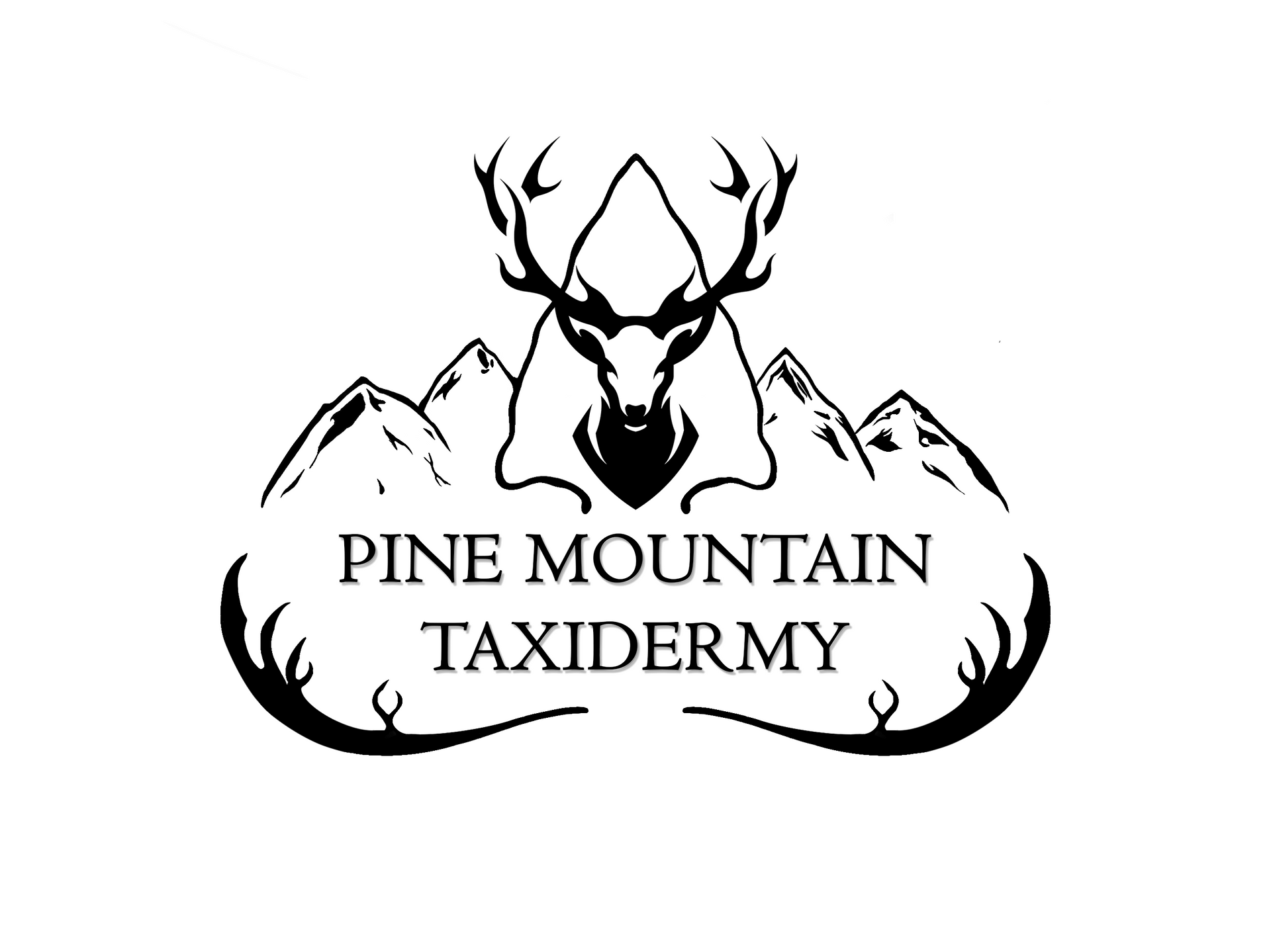
Pine Mountain Taxidermy is a taxidermy business located in South Carolina.
The owner wished to create a new logo that would embody the business's unique personality and establish a strong identity amongst competing taxidermy businesses.
Instructions for the logo were nonspecific, but the owner wished to include a deer, arrowhead, mountains, and pine trees - or as many as possible.
Various ideas were digitally sketched for this logo design, but I ultimately chose a layout that cohesively combined as many of the requested elements as possible.
The arrowhead seemed to fit naturally and seamlessly when placed into the angular peaks of mountains. These graphical elements create strong visual uniqueness both geometrically and symbolically when placed at the top of the logo. With the name of the business placed below the mountains, the overall composition was rounded off and unified by the rounded antlers at the bottom. Finally, the deer head was placed inside the arrowhead, staring directly at the audience and introducing a commanding presence.
The final composition ties together as many of the elements requested by the client as possible, without overcrowding the design. The overall shape and layout of the design is unified and recognizable.
The mountains, arrowhead, and antlers were digitally hand-drawn, while the deer head was licensed from Envato Elements.
The business card was designed as an extension of the desired brand identity. While no pine trees were included in the logo, this element can be found on the back of the business card with a pine comb pattern. The front of the business card is focused on primary contact information, framed by abstracted elements from the logo.
Print pieces were designed in the CMYK color profile for print-readiness, and documents were setup with bleed and trim margins. The logo was provided in PNG format for scalability and lossless image quality.
Lil' Guppies
Family-friendly scuba school for children // Logo, Business Cards, Envelope & Letterhead
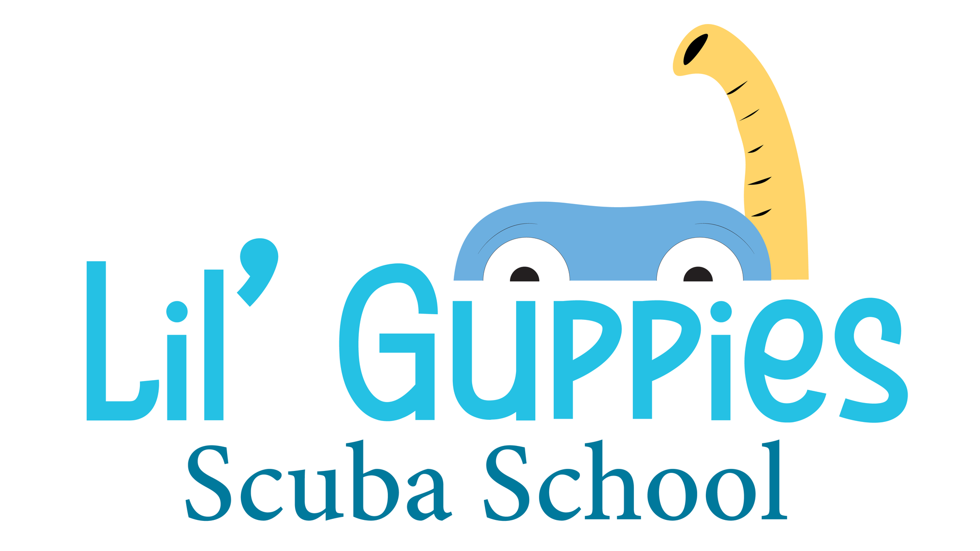
Lil' Guppies is a scuba school that specializes in teaching children how to swim and scuba dive. They hope to teach children strong swimming techniques and introduce scuba diving as a healthy activity.
This project was created as an assignment for a Graphics & Layout Print Media class. The goal was to create an entire brand suite for a hypothetical company, based on provided information regarding the business's purpose, target audience, and desired identity.
I sketched many ideas when designing the Lil' Guppies logo, but decided to focus on one that was simple, unique, and not overly designed. The final logo features a snorkeling character peaking inquisitively over the typographic elements; this aims to attach a human element to the logo and brand identity, increasing children's' comfort and identification with the brand.
A creative, semi-hand drawn, non-serif font was chosen for the larger display type to convey the family-friendly vibe. This is contrasted by a more professional serif font for the subtext.
The business cards were designed to convey a strong child-friendly, playful vibe. A strong aquatic theme is present through the use of bubbles, waves, and the prominent snorkeling character. Typographic elements interact somewhat with geometric design elements, as the email and phone number are placed on the wave.
The letterhead and envelope further embrace the aquatic theme with the wave and bubble elements. The letterhead features a snorkel rising along the right-hand side, creating brand cohesion.
Each brand piece is cohesively connected through a shared color scheme and shared visual elements.
Print pieces were designed in the CMYK color profile for print-readiness, and documents were setup with bleed and trim margins. The logo was provided in PNG format for scalability and lossless image quality.
TOWN
Authentic Asian cuisine with a modern twist // Menu & Table Tent
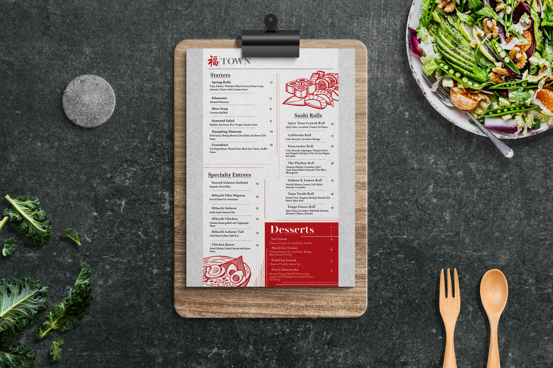
TOWN is a restaurant the offers authentic east Asian cuisine to a western audience. They use authentic, fresh ingredients, and would like to present a mixture of traditional Asian and modern western styles.
This project was completed for an assignment in a Desktop Publishing class.
The assignment was to create a menu and table tent with cohesive, on-brand designs for the hypothetical business. The existing logo was provided.
To create these pieces, I focused on tying together a clean, authentic style with westernized Asian design elements. The menu is organized into separate sections which are easy to navigate and distinguish thanks to large underlined headers and dividing lines. Individual items are separated by thin dotted lines. These dividing lines and appropriate font sizes help direct visual flow and establish visual hierarchy. Contrast is used to highlight special items, as seen in the red "Desserts" box.
The color scheme is a mixture of neutral beige and red. The beige represents authenticity and cleanliness, while the red is on-brand and consistent with the logo. Brand-specific style is represented with the red menu illustrations which include sushi arrangements and ramen bowls.
The table tent features a similar combination of neutral tones and fresh colors. Typographic information is arranged on plane black and beige, accentuated and framed by the same illustrations as seen on the menu. A traditional Asian pattern is printed at the top of the design, and imagery of fresh seafood is displayed in the bottom section.
The beige background of both pieces features a paper texture, adding to the feeling of authenticity.
Each print piece was designed in the CMYK color profile for print-readiness, and documents were setup with bleed and trim margins.
Hayao Miyazaki Typographic Portrait
Creative project // Typographic Portrait
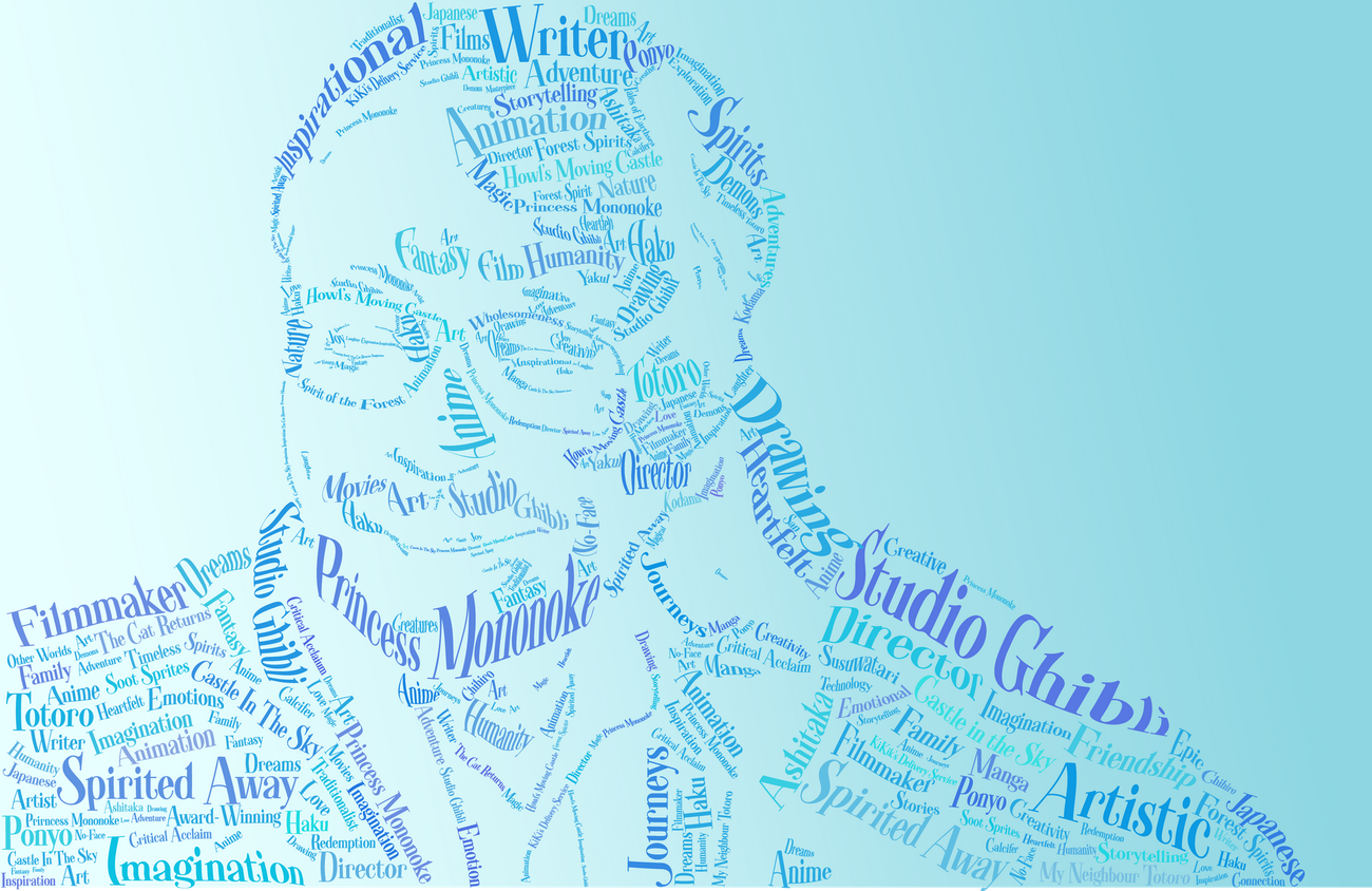
This is a typographic portrait of Hayao Miyazaki, created for an assignment in a Typography class.
Assignment instructions were to create a typographic portrait representing someone who we consider inspirational or significant in some way. The typefaces, words, and phrases chosen should appropriately convey the personality and contributions of the person.
Hayao Miyazaki is the artist and writer behind Studio Ghibli, one of the most well-known anime studios. He has created movies such as Spirited Away, Howl's Moving Castle, and Princess Mononoke.
For the portrait, I sought a photograph which best portrayed Miyazaki exhibiting significant personality traits - imaginativeness, kindness, and thoughtfulness. The photograph I chose features Miyazaki smiling with eyes closed, whilst propping his head up on his hand - fittingly representative of the "lost in daydreams" trope.
The typeface I chose was a traditional serif typeface, but featured somewhat hand drawn flourishes and high-contrast line wight. This typeface is accurately representative of Miyazaki's artistic style because it conveys both traditionalism and creative, handmade personality.
Words and phrases were chosen to represent his artistic works, personality, and career achievements.
The words were placed using Adobe Illustrator. They were warped and modified to create the illusion of depth and shape. Various sizes and colors were used to allow each unique word or phrase to be emphasized individually and prevent repetitiveness. This also helped create the illusion of value and 3-dimensionalism.
A blue and purple color scheme was used, and the background features a gradient between royal blue and light blue; this color allows the background to remain subtle and non-distracting, while still providing enough contrast for the portrait to be legible.
The Enchanted River
Creative project // Illustrations
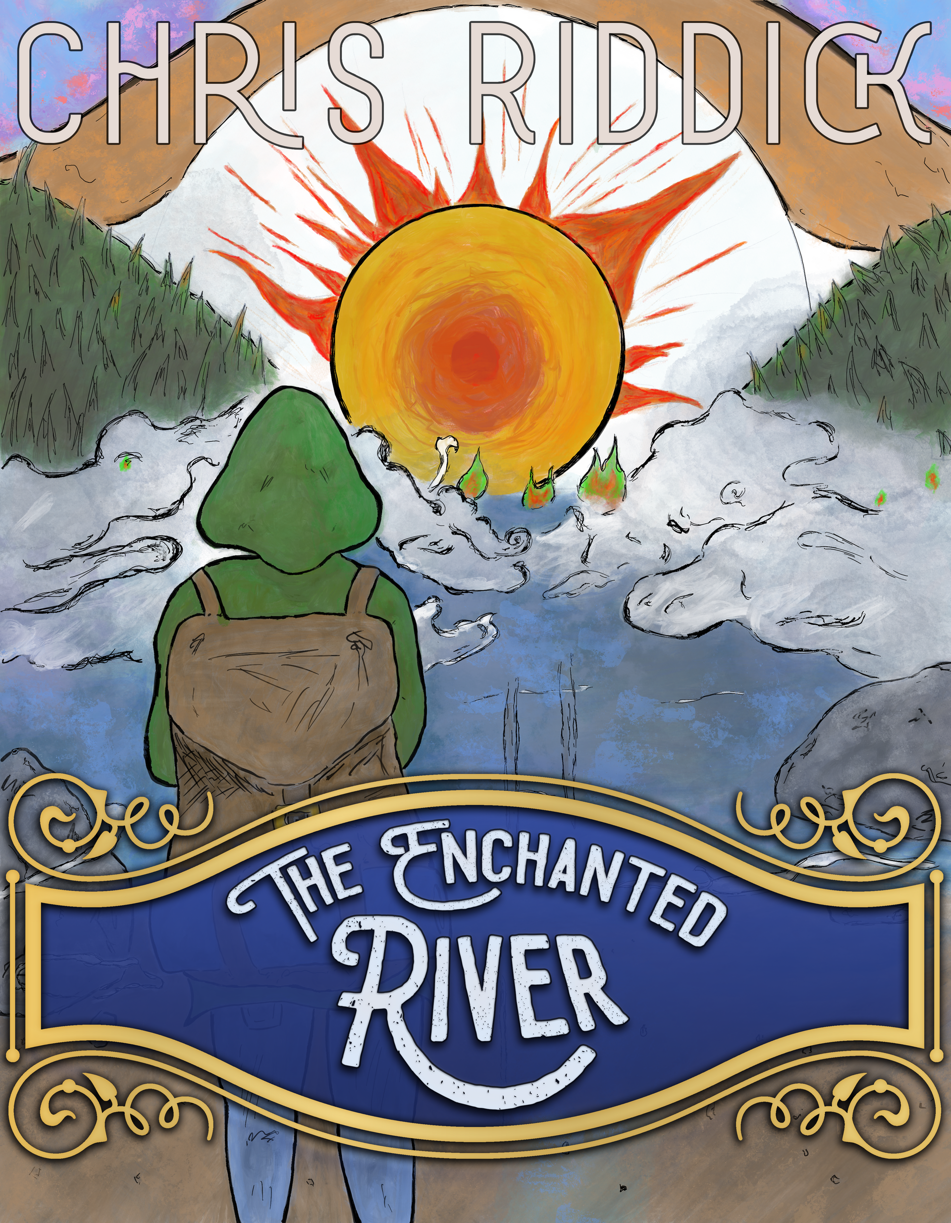
The Enchanted River was a short writing prompt provided for an Illustration class.
It described a girl standing on the bank of a misty, illusory river where the water couldn't be distinguished from the ground. The bank of the river was wrapped in fog, and when she seemed to be splashed with water, it turned out to only be misty fog. She would see green-tipped flames fall on her skin, only to realize they were simply leaves. Similar flame-like leaves could be seen on treetops poking through mist in the distance. The girl was preparing to venture through the river, continuing on her journey to some further destination.
The assignment was to illustrate a book cover which could accurately represent the scene described in the writing prompt.
I began by sketching a variety of different compositions which illustrated the thematic narrative of the writing prompt. I focused on creating the otherworldly atmosphere of the mist-wrapped river and bank, and invoking a sense of the girl's intrigue in the audience.
I chose two compositions. Both created a similar sense of atmosphere and mystery.
One scene left the insinuation of someone venturing off into the mist, while another features the girl staring off at the path ahead. In both, the water seems to fade into the ground, depicting the way they blend together in the written passage. In the illustration with the girl, an abstract sun-like eye is seen on the horizon. This creates a fiery sense of intrigue and mystery, while also representing the aw felt by the girl as she peers into the distance.
Creative, embellished typefaces were chosen to convey the feel of classic storybooks. Plaques were added as backdrops to the titles to ensure they remain readable and distinguishable from the background. In the first composition, the "writer's" name it placed at the top of the illustration, blending with the illustrative art.
Amethyst Bay
Relaxing getaway at an island resort // Magazine Ad & Web Banner
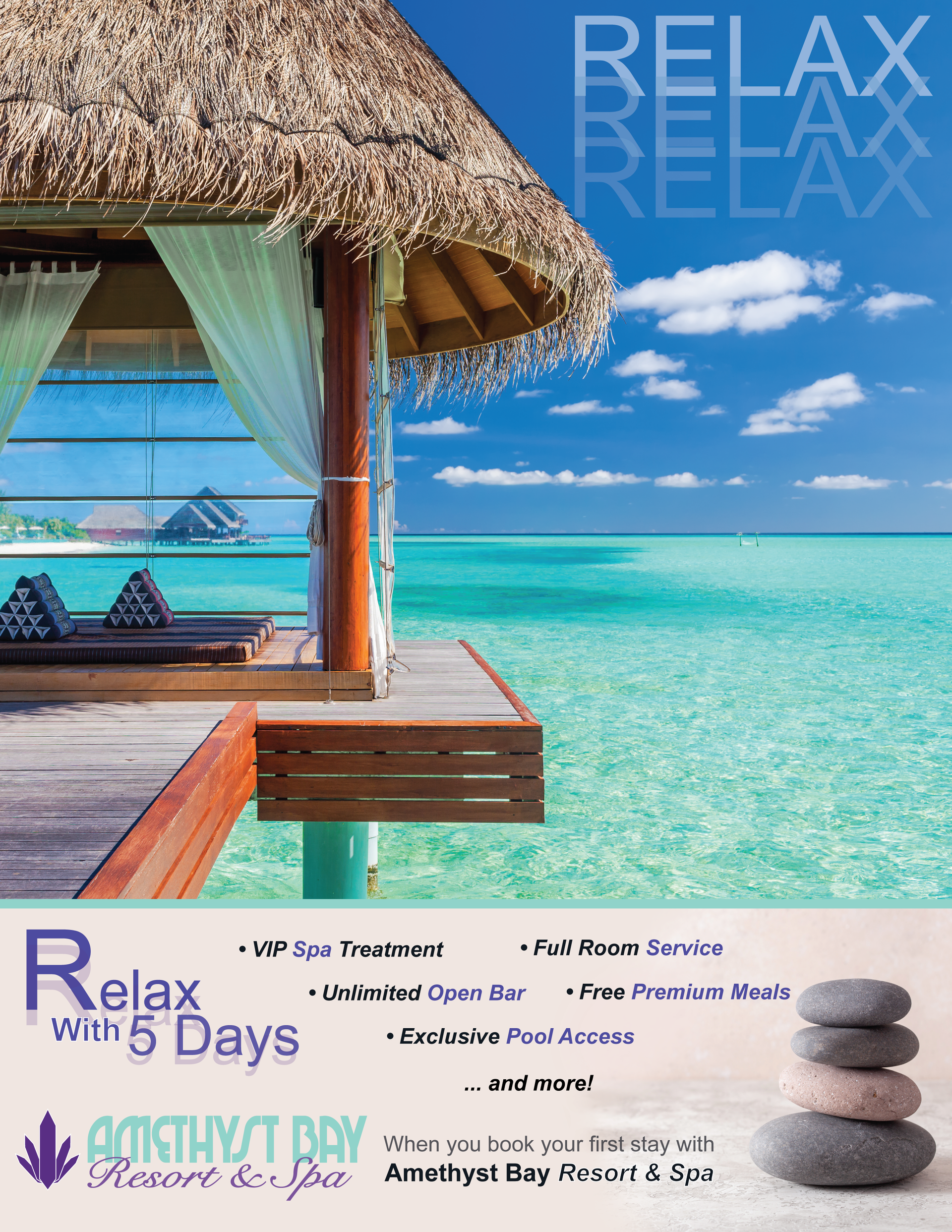
Amethyst Bay is a resort and spa located on a tropical island coast.
This project was created as an assignment for an Intro to Digital Imaging class. The objective was to create a magazine advertisement and digital web banner advertisement to drive resort sales.
Both design pieces were requested to be cohesive and visually relate to each other.
The magazine ad begins by grabbing attention with the picturesque imagery of clear blue water and an inviting waterfront gazebo. The word "Relax" is faded into the upper-right corner, a nod to the trope of someone falling asleep.
Typographic information about the resort is placed against a sand-colored background on the bottom of the page. Here, the "Relax" message is repeating, while suggesting viewers relax by booking a stay at the resort. The perks of staying at the resort are listed in bullet points, followed by a call to action. The resort logo and more on-theme imagery is scene in the bottom corners.
The digital web banner serves as an extension of the magazine ad, featuring the same imagery and general message. The "relax" message is accentuated here, as an animation highlights the word before it drifts downwards - mirroring the imagery in the upper right-hand corner of the magazine ad. A simple message - "Unlimited beach massages on us with your first stay... book now" - serves as the call to action, while providing a link to the reservation website.
Both designs focus on creating appealing visual representation of the relaxing beach resort atmosphere while enticing viewers with offers of a special package deal. The designs remain cohesive by utilizing similar layouts, imagery, and color schemes.
Both designs are on-brand, emphasizing the brand logo and identity. The magazine ad was designed in the CMYK color profile with bleed and trim margins to be print-ready, while the web banner was submitted in GIF format for scalability and lossless image quality.
Additional Links